Spring practically screams color—from the Easter eggs, to the flower beds, to the newest nail polish shades…
So there’s probably no better time to experiment with color in your email marketing—including the creative you supply to your email partners. Below, we’ve listed some colorful statistics about branding, buying, and testing. Review these lessons in color psychology; then use them to create brighter mailings for your brand subscribers and for your affiliate email partners.
 How Color Affects Brand Perception
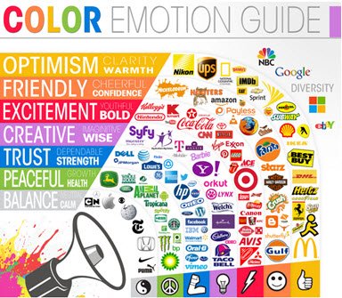
No doubt you’ve seen this chart, outlining color perceptions and the brands that leverage them. We all know, for example, that blue is supposedly a universal marker of trust and competence. Green connotes health, growth, and earth friendliness. Some of these examples test the model. (Is Taco Bell really wise? Creative maybe, in terms of its recipes…) But by and large, you can see how this marketing rainbow works.
Proving color theory is another story.
There’s not much hard science to support the responses different brand colors elicit. But there is science to support the value of consistency and strong branding. According to a radiological study of consumer partici
pants, familiar brand logos activated cortical areas involved in positive emotional processing and associated with self-identification and rewards. Weaker logos, on the other hand, forced participants’ brains to activate “working memory” areas, and produced a negative emotional response.
Email acquisition is a powerful tool. Just don’t let it dilute your brand’s greatest strength (recognition). Try to keep your affiliate email partners on a short leash, in terms of design specs and creative alignment. By giving them the colors, fonts, and images you’ve designed, you’ll be helping your conversion rates in the long run.
How Color Affects Purchasing Decisions
Color can also improve your marketing in the short term, apart from those major choices about logo and branding. Studies indicate color can single-handedly improve readership rates (up to 40 percent), increase comprehension (up to 73 percent), and actually accelerate learning (between 55 and 78 percent). This is good to know if your products or services have more benefits to offer than what immediately meets the eye. Highlighting important features or promotions with color might gain you a few extra seconds of attention.
There’s also evidence to suggest that different audiences have unique responses to different colors and color palettes. Female consumers are said to prefer blues, purples, and greens, while men are drawn toward black. Neither sex likes orange; yet it may be the color most likely to entice impulse shoppers.
Hard science or no, most brands have already factored color perceptions like these into their logo/website designs. But there’s still room to experiment with color psychology within more segmented messages.
Places to Insert Color in Your Creative for Email Partners
- CTA Buttons
Have you tested different colors for CTAs yet? Of course you have. According to one Performable study cited by HubSpot, red CTA buttons outperformed green CTA buttons by 21 percent! As always, the best approach is to conduct your own A/B testing on your own audiences.
One way to maintain consistent branding, but still test color theory is with bright background shades. Here, Shutterfly sticks to its trademark black buttons, but lightens the overall effect with a splash of forsythia yellow.

- Email Links
There are lots of case studies that compare the effectiveness of traditional blue links versus alternative link colors. Some suggest that bolder link colors generate higher conversions among new visitors/new subscribers, who are perhaps less entrenched in the usual look and feel of your messaging. Here again, test different options; then use the winning results in your specs for email partners.
- Images

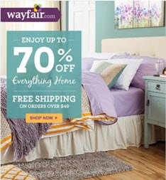
Images help recipients process your message faster. If you want to ensure the end result is a positive one, borrow this tip from retailer merchandisers: tell a story with color. By designing an image and a color-coordinated CTA around a mood or a concept, your email subscribers may be more inspired to go after your product. Here’s a great example from Wayfair.com.
Just keep in mind that most ESPs block images by default. Some sources say up to 60 percent of customers have email images disabled. Descriptive, compelling ALT tags can help entice more people to view your message in full.
Also remember not to incorporate oversized images or image-based information displays with minimal accompanying text. Your email should contain a balanced text-to-image ratio to avoid getting filtered as SPAM.
Tell us what you’ve tried and where you’ve triumphed with color in email marketing. We love hearing your stories!
![]()
