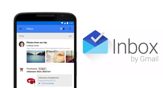
Are you up to speed on the Google Inbox email app and desktop interface? Google’s Inbox by Gmail already has over 47,000 followers, even though it’s still an invitation-only service. And just last month, Google announced Inbox for Work—another invitation-based rollout, allowing Google Apps for Work administrators to request access to the service. With thousands of consumers clamoring for this new email experience, email marketers can’t afford to ignore the change.
 Users are excited about an email service that promises to make them more productive. Marketers, on the other hand, should be excited about the look and functionality of new message lists—a new email experience that creates even more incentive for brands to be timely, visual, and engaging.
Here are a few components you’ll need to get there:
- Video Content
In an effort to make landmark email content more accessible, Inbox offers a Highlights feature that pulls information from inside an email and stamps it to the main message list (think flight info or confirmation numbers). Highlights ensures that emails containing videos, photos, or other attached files will get more real estate in the Inbox. Users will be able to click play or view/open the file without actually opening the message that delivered it. And this might mean compelling video content is soon to be as important as a compelling subject line.
We’ve talked about the emergence of video in email marketing before. Google Inbox seals the deal. Imagine how well text-only emails will perform in a queue of promotional emails wherein some are displaying colorful still images with play arrow icons. We already know that tweets with images and video get more attention than textual posts. Time-strapped consumers will likely display similar behaviors when choosing what to read and what to forward inside a more visual inbox.
- Location-Based Promos
Are you already using geotargeting or “geo-conquesting” strategies within your email campaigns? If you’re seeing any success based on mobile customers’ movements, the new Gmail interface could take you to the next level…
Google Inbox features a “snooze” component, which allows mobile email app users to ignore a specific message until some selected future time, or until they are geographically in a relevant space (e.g. at home, at work, or inside your store). Imagine how your marketing teams might be able to leverage this functionality—even encouraging subscribers to snooze on a particular email until they’re at XYZ address: your nearest store location. Recipients would then get automated pop-ups, reminding them of your message (along with your product highlight or coupon/offer) at the precise moment they need it.
- Better Engagement Ideas
Google Inbox gives new meaning to the term “low priority.” In fact, it’s an actual directive now. So in addition to (or instead of) being labeled as a Promotional email, your message might soon get bundled as a low priority read. What’s worse, some users will opt to have low priority messages not just separated, but excluded from the main Inbox view.
Your response? Be the brand that subscribers have to connect with. Keep in mind that Google Inbox is meant to function more like a to-do list than an email repository. By giving recipients opportunities to take action (or delay action until a specified future date), your messages will be more in sync with the mindset behind this new interface.
So give them images to pin. Give them exclusive discounts to cash in. Give them time-sensitive calls to action. And don’t forget to give them a big, bright, colorful logo. Your sender image has never been so important. According to this HubSpot overview, “Gmail automatically pulls in the logo used on your company’s Google+ Page in the Promo Bundle—as long as you have the Google+ Related Pages Widget enabled.”
Have you started using Google Inbox? We’d love to hear about your experience!
![]()
